
Friday, 14 October 2011
Sunday, 9 October 2011
So far...


Wednesday, 5 October 2011
FINAL PROJECT
Today we discussed our final project with tutors and found the strengths in our design. For me these were:
MOVING ROOMS- Can be detached from the building and taken to a new site/ location.
USE OF LIGHT- Moving parts change light entering the building.
STRUCTURE- Floor and ceiling are the same because of hollow blocks.
My statement so far:
My project is about the gathering and gifting of space. Four rooms have the ability to be detached from the building and transported to the colleague's wishful site to allow them to work with their projects.
The structure is situated by an apartment block close to the old railway station. This position fits the purpose of the design because the train can be used to carry the detachable room to new locations.
The location was also a good choice because it gives access to the colleague's needs which are all in a ten minute walking radius.
To create a threshold I attached the structure to the apartment building to provide a sense of new and old. To contribute to the sense of space the light levels inside the building will change because of a moving system. This gifts space because the only way space is visible to us is through light, thus the changing light levels can give the sensation of a changing space.
Sunday, 2 October 2011
PEER REVIEWS PROJECT 4
For project 4 i was reviewing a group on augmented reality. After seeing these I realised the amount of development now being undertaken now than when I did the project at the beginning of semester.
Yiheng- yjialo7.blogspot.com
Yiheng produced a portion of stairs for his 1:1 that was from his second life creation. I was impressed by the stairs because they weren't just the ordinary set of steps. Each step had been connected to the next step diagonally giving a contemporary or even futuristic style. Everything had been properly and neatly assembled making the steps a functional model.
Tessa Forde- http://architessa.blogspot.com
Tessa decided to make her 1:1 a tensile structure that would cover the bridge and capture the change in light as the train moves through the incased tracks. To show this in her final model she stretched fabric completely around different shapes to reveal the effects. Her shapes included concrete blocks, aluminum sheeting and large wooden prisms. I found it a very interesting project when the halogen lamps turned on inside, projecting this tightly wrapped shapes on the inside of the fabric.
William Brooke
Unfortuantely William didn't turn up so i will try to hunt down his blog in the mean time.
Wednesday, 28 September 2011
Final building
As you can see the building had drastic changes made but the concept has still been kept the same because it can still "gift space". This can be seen when platforms are clicked they expand creating a larger room. These expansions can be used in different seasons, for example in winter the balconys will not be extended to provide more closure then in summer it would be vice versa. The ceilings and floors are the same prim because floors are produced from hollow blocks. This is useful because less prims are used. The materials used are concrete and glass because of theyre to opposing textures.
MY WORD PLACED IN A TRADITION
If I was to place a word in today or tomorrows traditions it would be post conservatism because I believe our past should still be strongly integrated with our designs today, this allows traditions too be passed on giving the architecture more meaning.
MY WORD PLACED IN A TRADITION
If I was to place a word in today or tomorrows traditions it would be post conservatism because I believe our past should still be strongly integrated with our designs today, this allows traditions too be passed on giving the architecture more meaning.
Monday, 26 September 2011
Bringing the design into 21st century.


This is my final view of the office.

Interior view of the bottom floor with the stairs leading up to the second.
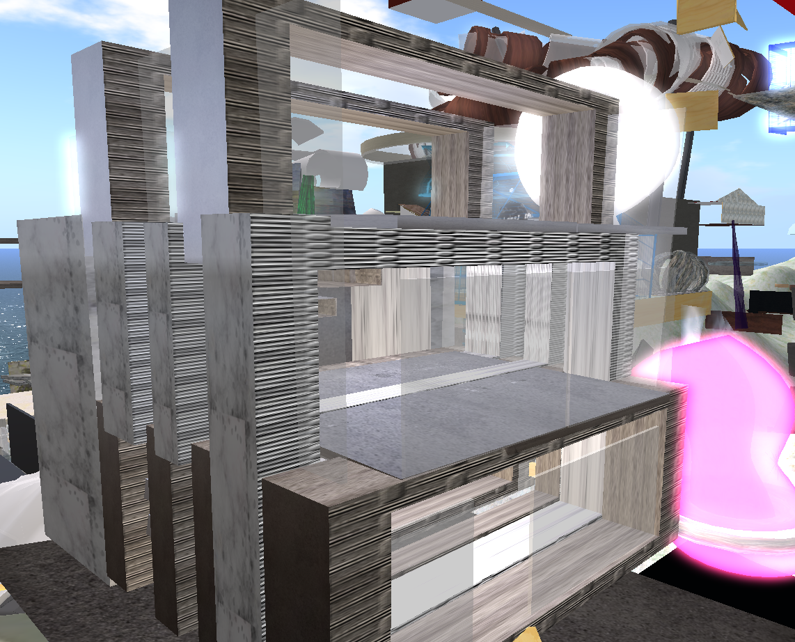
I decided to yet again completely change the architecture of my building but in doing so i still kept the initial concept. Due to problems on second life I was forced to move my building to a new site but this worked out better in the long run because the building can be seen properly and also allowed me to extend.

This first concept had rotating blocks on the outside to work on the mechanics of changing light in the building. The rooms had extended walls to provide harmony between the building and natural environment.

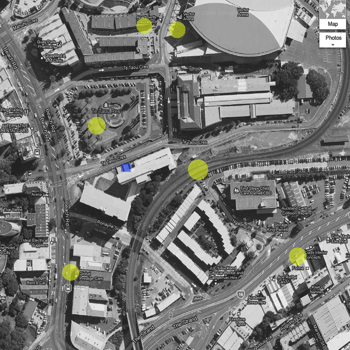
Map of selected services, such as fabrication, railway station to transport the mobile rooms: all in 10 minutes walking distance from the office (blue box).
Sunday, 25 September 2011
OFFICE ON SL
I have reconstructed my office on Second life. I haven't developed the concept yet but decided to play with materials and colours to show some expression that could support the idea of gifting.
Tuesday, 20 September 2011
Drawn motion of my animation

I have drawn the motion of the animation like this because it reminded me of the motion of a typewriter where it is a step by step motion then quickly slides back to the beginning. In the video I make drawings step by step but then come back to them to add more detail or change specific ideas.
Discussion: gifting
I decided to post on the digital carnival page about gifting opinions. I find this interesting because a person opinion has the ability to change how you perceive. All in all peoples opinions help you form your own but they also put you in a new direction by developing your perception.
http://www.campusprogress.org/articles/the_craft_of_having_an_opinion
http://www.campusprogress.org/articles/the_craft_of_having_an_opinion
Monday, 19 September 2011
SCULPTIE
 Today we began learning basics on 3ds max design to construct a sculptie which has influence from a part of our previous project. We also viewed the 3D scanner that will come in good use in the future.
The image to right is the prim I composed on 3ds max. To change the shape i selected soft selection so when a point is moved, a few other points change as well giving a more natural appearance.

My sculptie is supposed to be a pencil holder for use in the office. I didn't construct a part of the building because the office is produced out of geometric shapes.
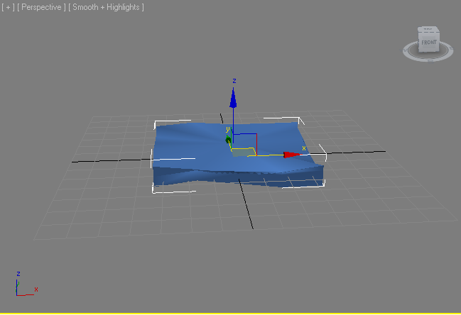
 I decided to change my sculpty to a wall because the original was more a peice of furniture.
Sunday, 18 September 2011
Peer Reviews 15/9
GATHERING: SECOND LIFE
[1] SAM WONG : http://swon202.tumblr.com/
Sam's clients were:
Tips that Sam gave me were:
[1] SAM WONG : http://swon202.tumblr.com/
Sam's clients were:
- Engineer
- Illustrator
- Scientist
- Millionaire
Tips that Sam gave me were:
-Reactive things are the most important
-Remember to do scripting
[2] YUCONG SHAN :
Steven's concept came from an image of a buildings but the photo was taken with open shutter. This made the black and white image have a ghostly appeal with its distortion of moving objects. This image inspired Steven to create an interlocking office block where each room connected with some kind of space instead of just being a room with a door. The material selected were translucent glass that reflected the colours of the open shutter image making the building have a sense of movement.
[3] CHEN XINRAN:
Unfortunately Chen had to produce her office block on google sketch up because the Second life island had filled its capacity as all prims had been put to use. Chen decided to design her office as a dancing platform/studio because this is something she is passionate about. She included parts of her last project such as her lamp shade that had been cut to appear like flames. This was used alot in her digital building to let different amounts of light into the building.
finished design
The finished design could be considered to be a moving building because the four rooms could be slid out of the facade and transported to a site where the colleague could do physical work. My 5 colleagues were an Accountant, Designer, Marketer, Engineer and truck driver.
Wednesday, 14 September 2011
Wednesday, 24 August 2011
Animation- Start up
 This maps shows the areas that are within a ten minute walking distance from the office found at the old railway station.


In my design i want to focus on the gathering space, where spaces from different contexts can be gathered together and integrated. After they can be dispatched to gather a new space in a different location.
Sunday, 21 August 2011
Peer reviews
Yiheng He- ccarchdesign.blogspot.com
Damien focused on natural aspects such as water,air and light. With these he designed a space that has sustenance for the natural environment.
Light was used to show warmth which was revealed when the design had concrete frames to show the shadow effects.
Water was related to road because it divides land and space.
Air was perceived as the space within the design.
Xiang Li- archides101.blogspot.com
Xiang Li focused on the sustenance of travel showing this through trains and wires that revealed at some point peoples lives merge together for example when people meet at university they all travel from different place to the same place.
Feng- tonysarchilike.tumblr.com
Feng focused on the comforts of your own environment. This was shown through various images that show places such as the kitchen, living room and bathroom which are the main places we spend time in our day to day lives.
From the crits i found with this workshop it is best to work at a fast pace and keep ideas straight forward.
Wednesday, 17 August 2011


Sunday, 14 August 2011
Research

 I researched into a lot of Da Vinci's work because he invented machines using simple mechanisms.


Clock stall
 Walls which rotate and let the light in at different times.
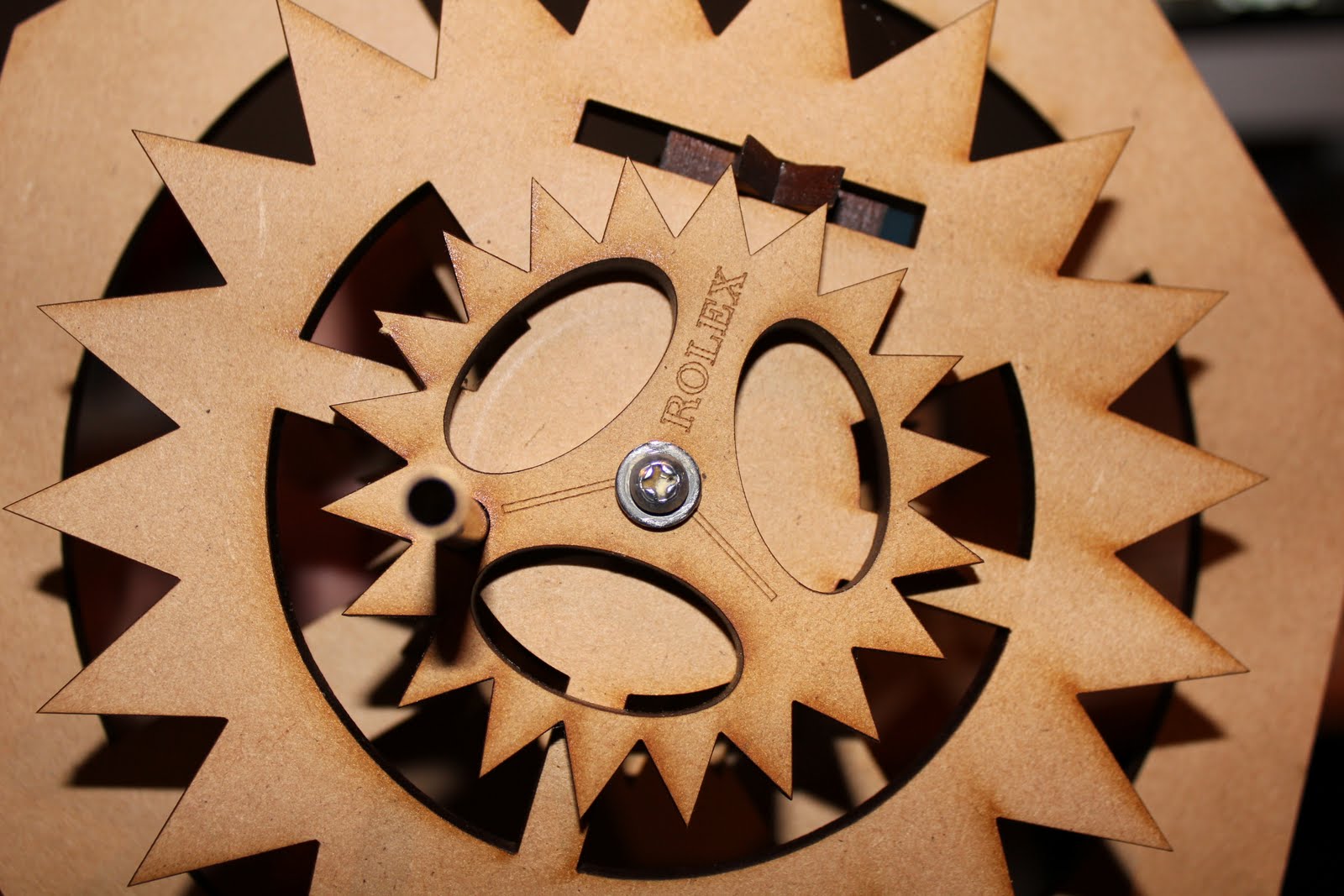
 Using already made cogs, I constructed the mechanical system to find ratios for the cogs and to see if it would work.
 Mechanical system working.
LASER CUTTING
My market stall is going to sell clocks and watches therefore i decided to design a market stall that not only uses cogs as an ornamentation but also as a mechanical system that will open doors and windows at different times. This is possible because the cogs will placed in a way that will make the outside wall shift around the inner wall. These sketches show how.


Wednesday, 10 August 2011
Update on first project
 Beginning of 1:1 final model: Detail of the movement of the bed to a higher point.
  Waking monument
 Waking monument: transports the bed to the top.
 1:5 model of the detail which lifts the planes. Working mechanical system.
Subscribe to:
Comments (Atom)